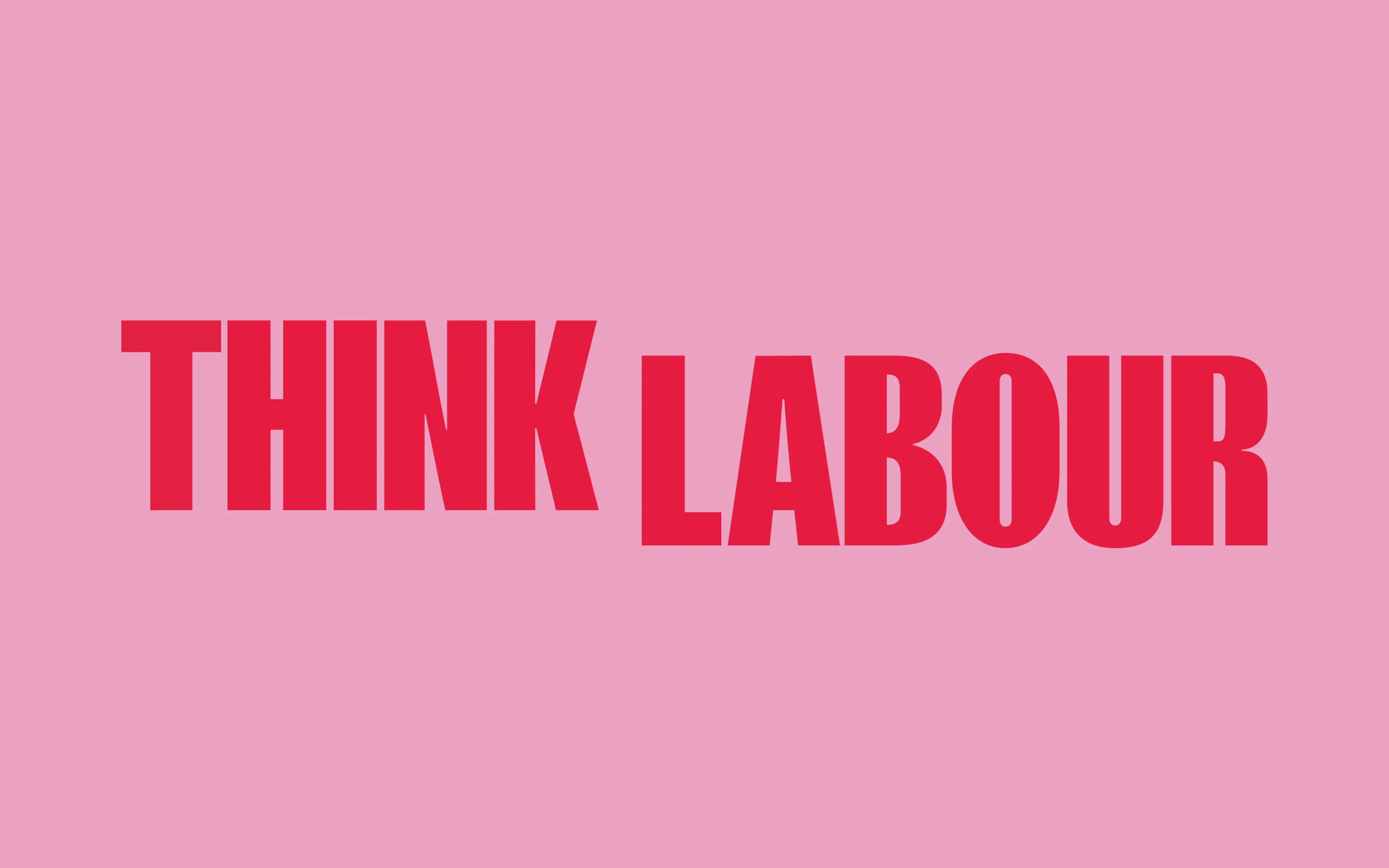
ThinkLabour
Rethinking a Think Tank
- Brand Identity
- Website Design
ThinkLabour works openly and collaboratively with Ministers, MPs, mayors and others across Labour and beyond to develop bold, innovative and radical ideas to help create a fair, strong and prosperous Britain in an increasingly uncertain world.
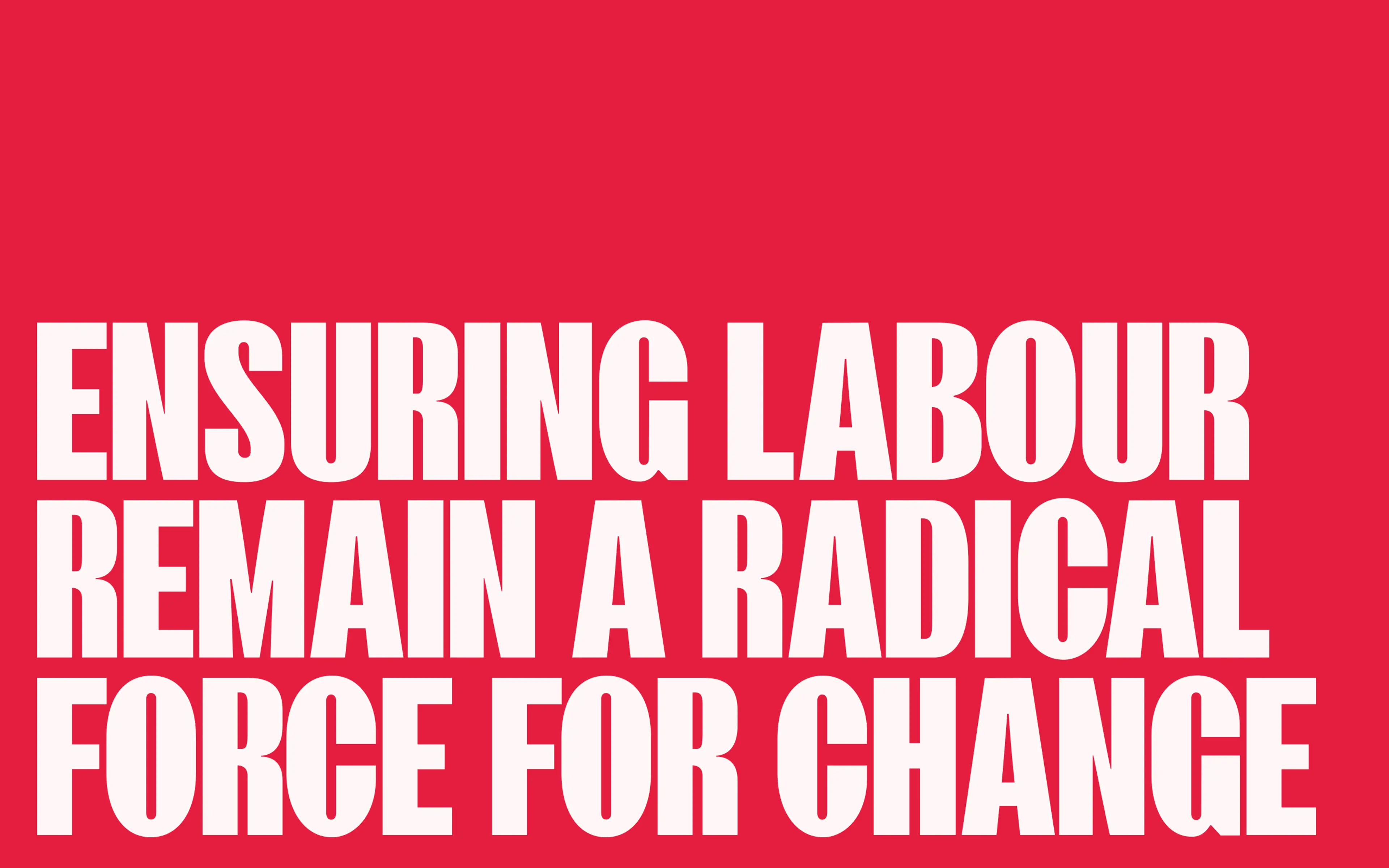
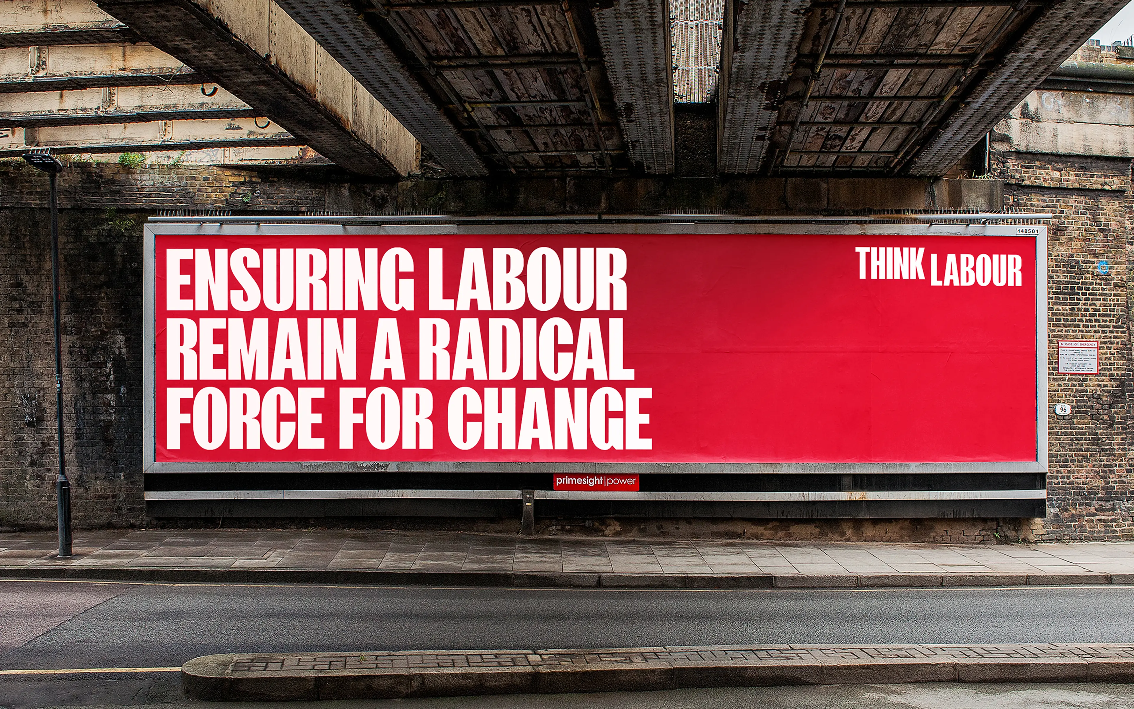
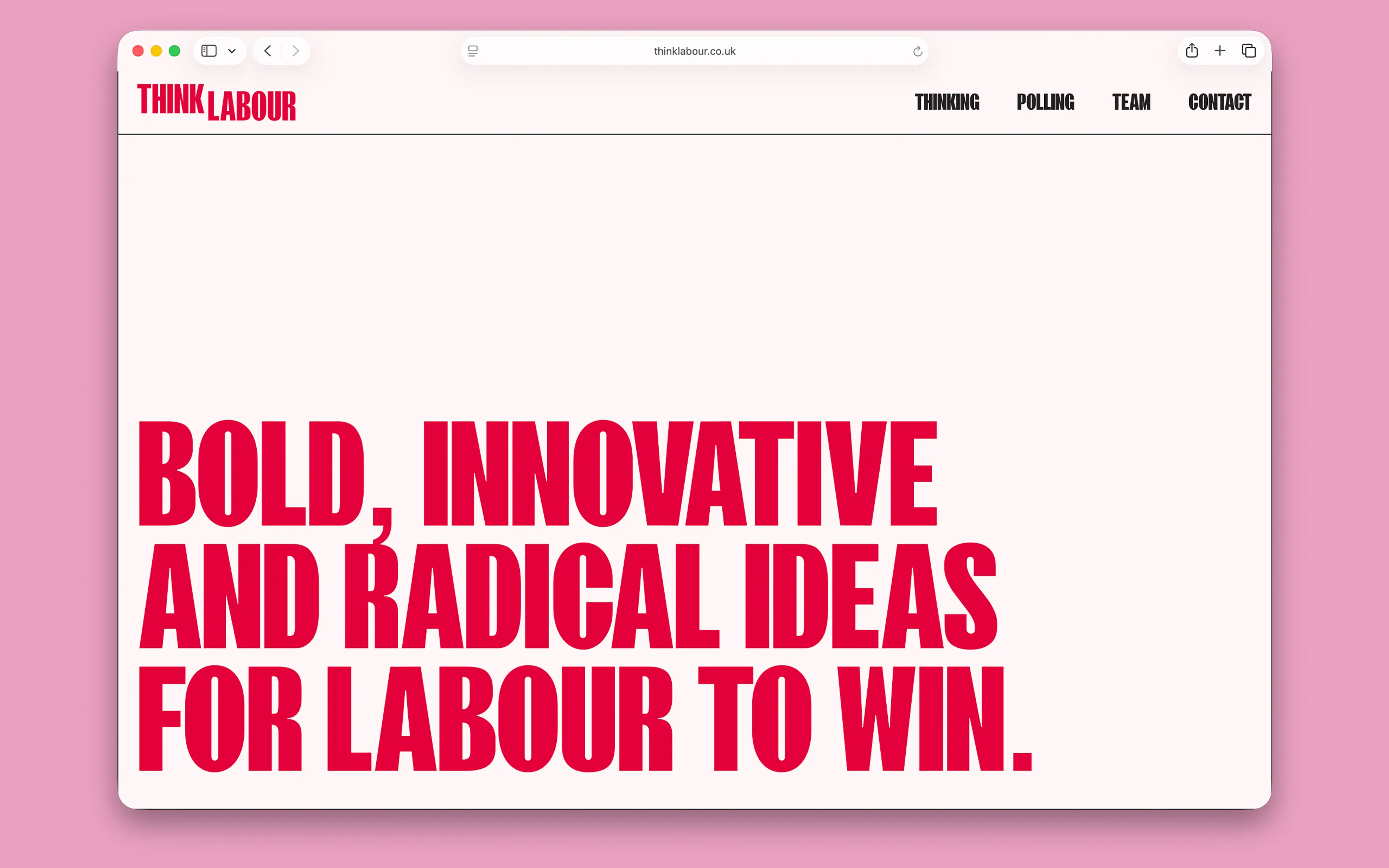
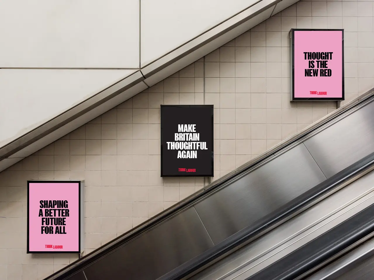
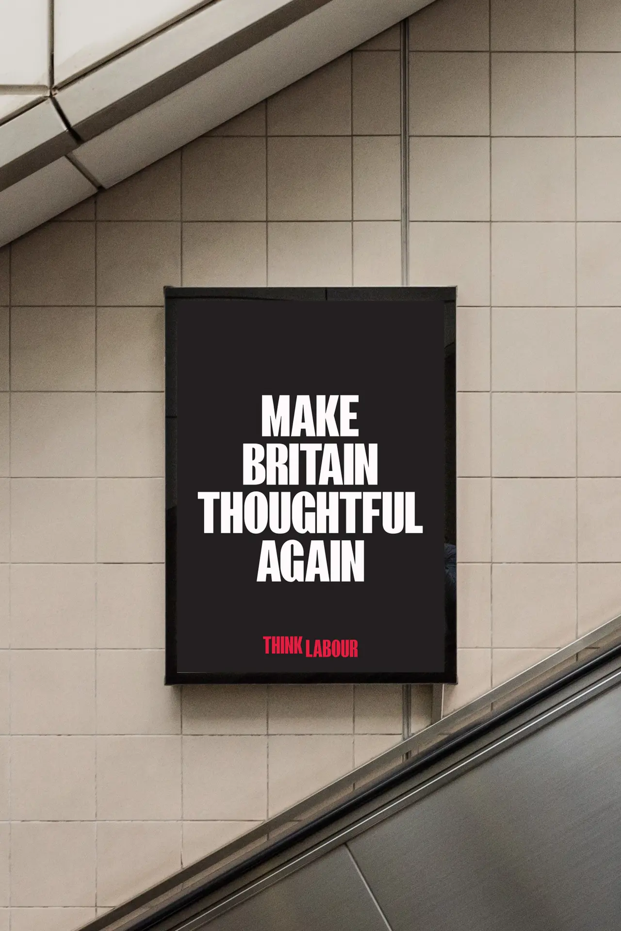
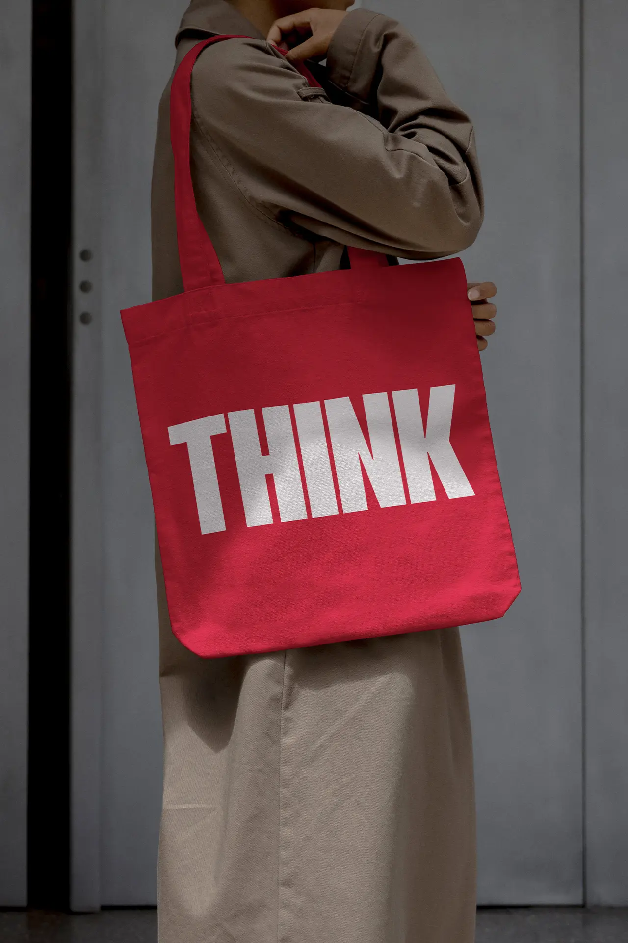
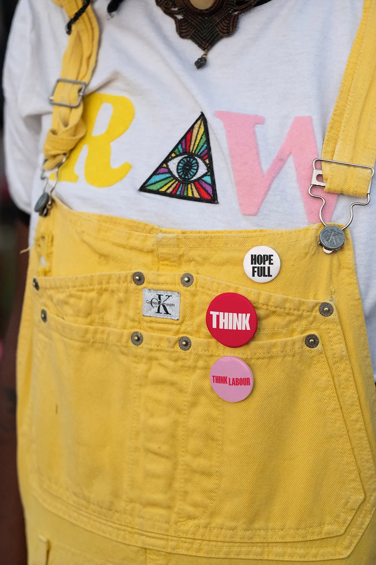
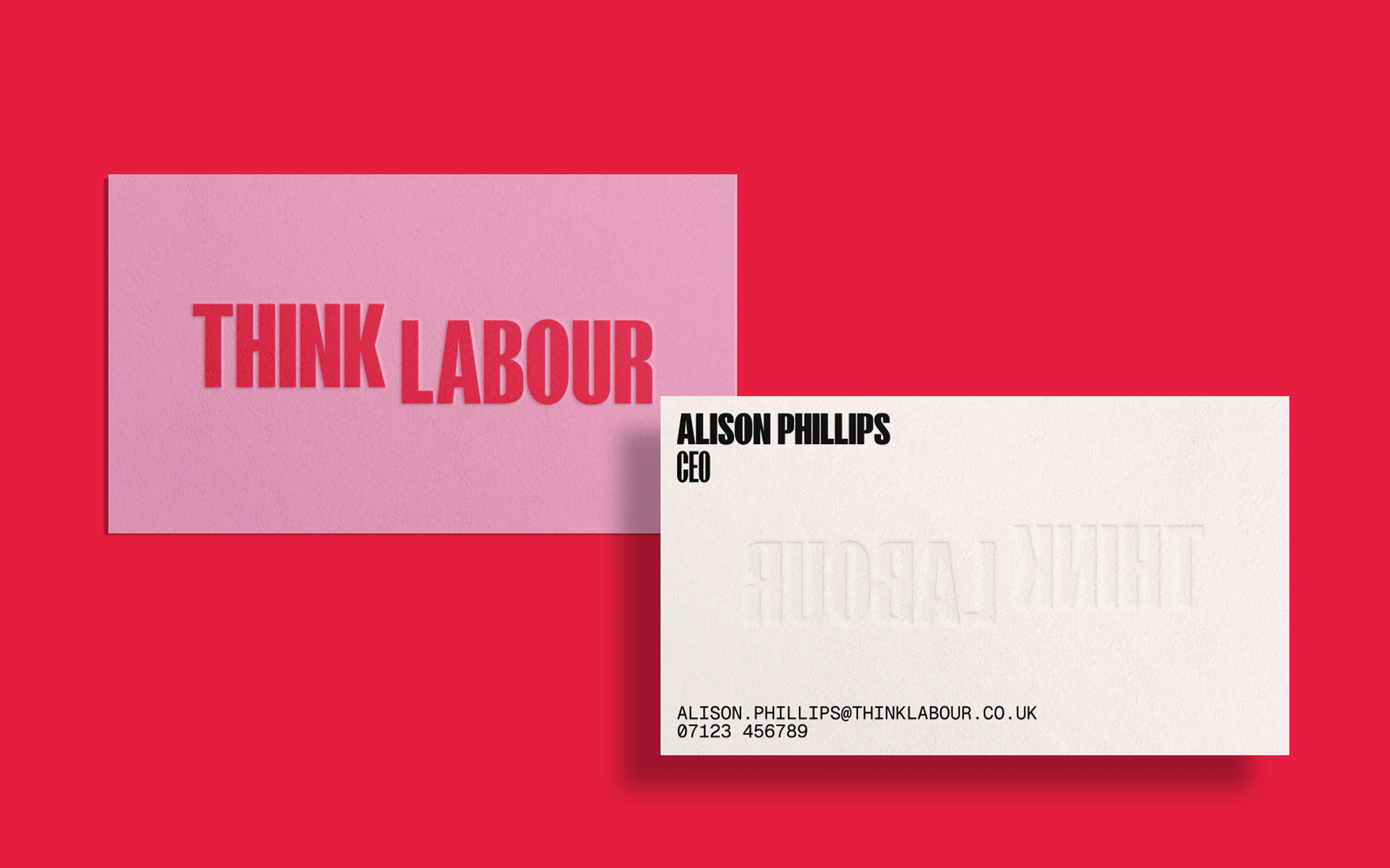
The District were briefed to create a visual and verbal identity as they embraced a new chapter under a new name (previously Labour Together, a manifestation considered responsible for putting the party into government). Leaning into the vernacular of activism The District created a concept that was visually bold and verbally provocative - a call to arms. As straightforward as the think tank's mandate - to impact socially, raise public awareness, influence policy, shape education and increase community cohesion, as society becomes more fractured - the new brand identity had to land. Wit was introduced in the form of a slightly elevated THINK to emphasise its importance and the introduction of pink to the palette, which brought humanity as well as something unexpected and fresh.
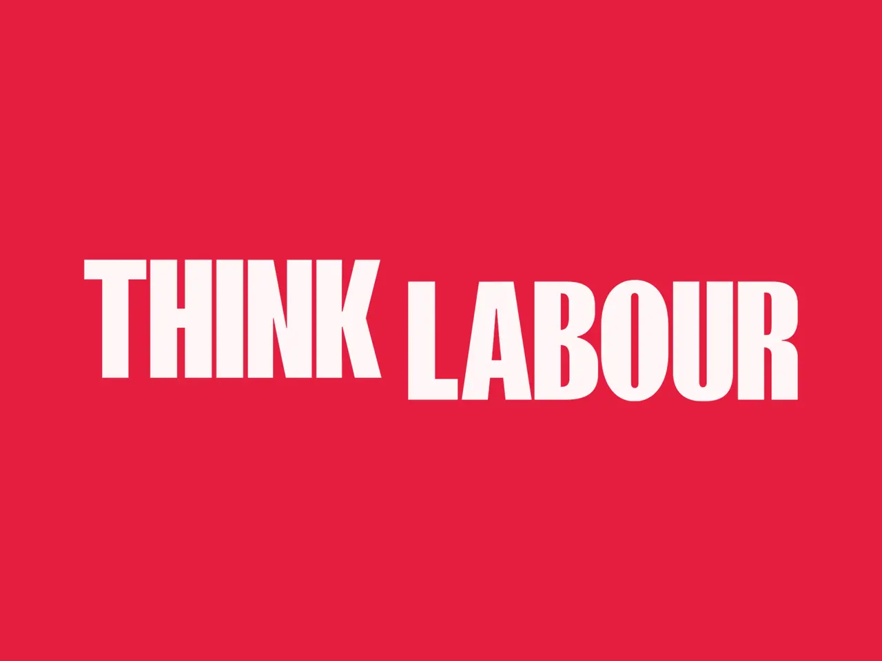
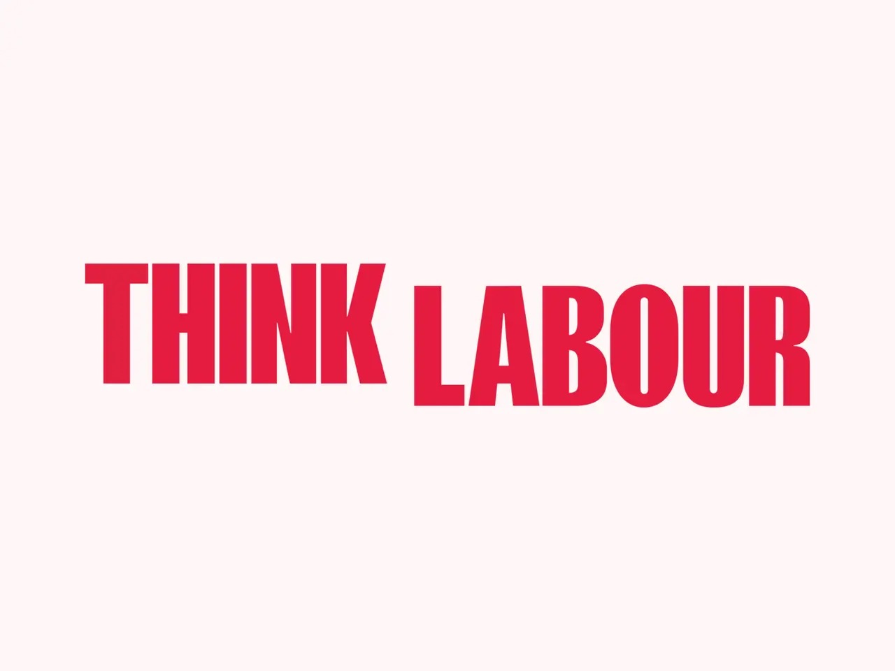
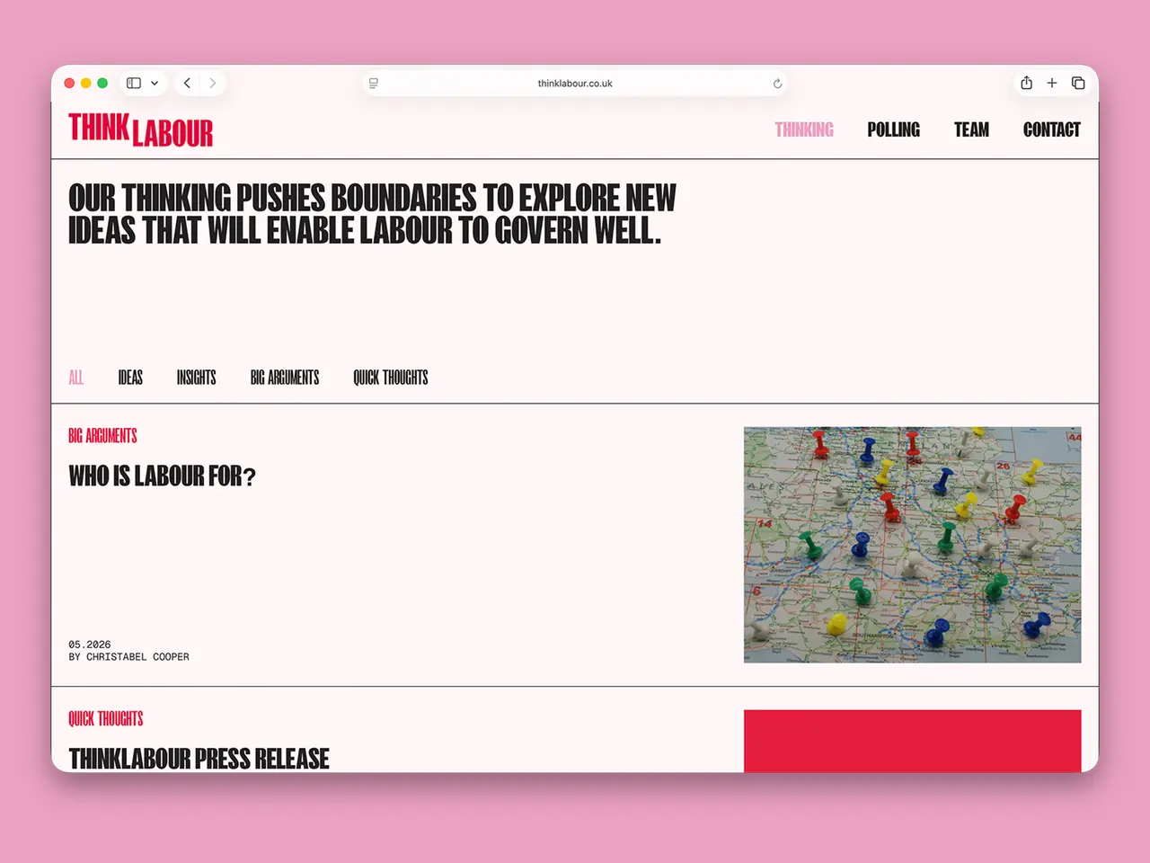
Execution when applied off and online, was single minded. Removing any extraneous elements or fuss, strong typography and colour took centre stage, occasionally introducing imagery if, and only if, something was added when included. Its distillation was its power.