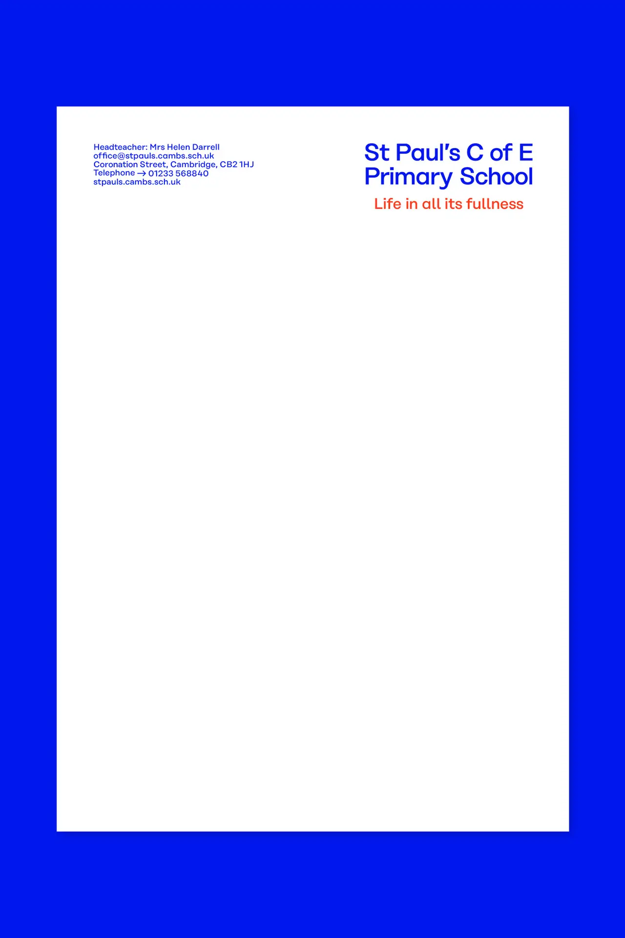
St. Paul's
Life in all its fullness
- Creative Pool: Bronze (2022)
- Brand Identity
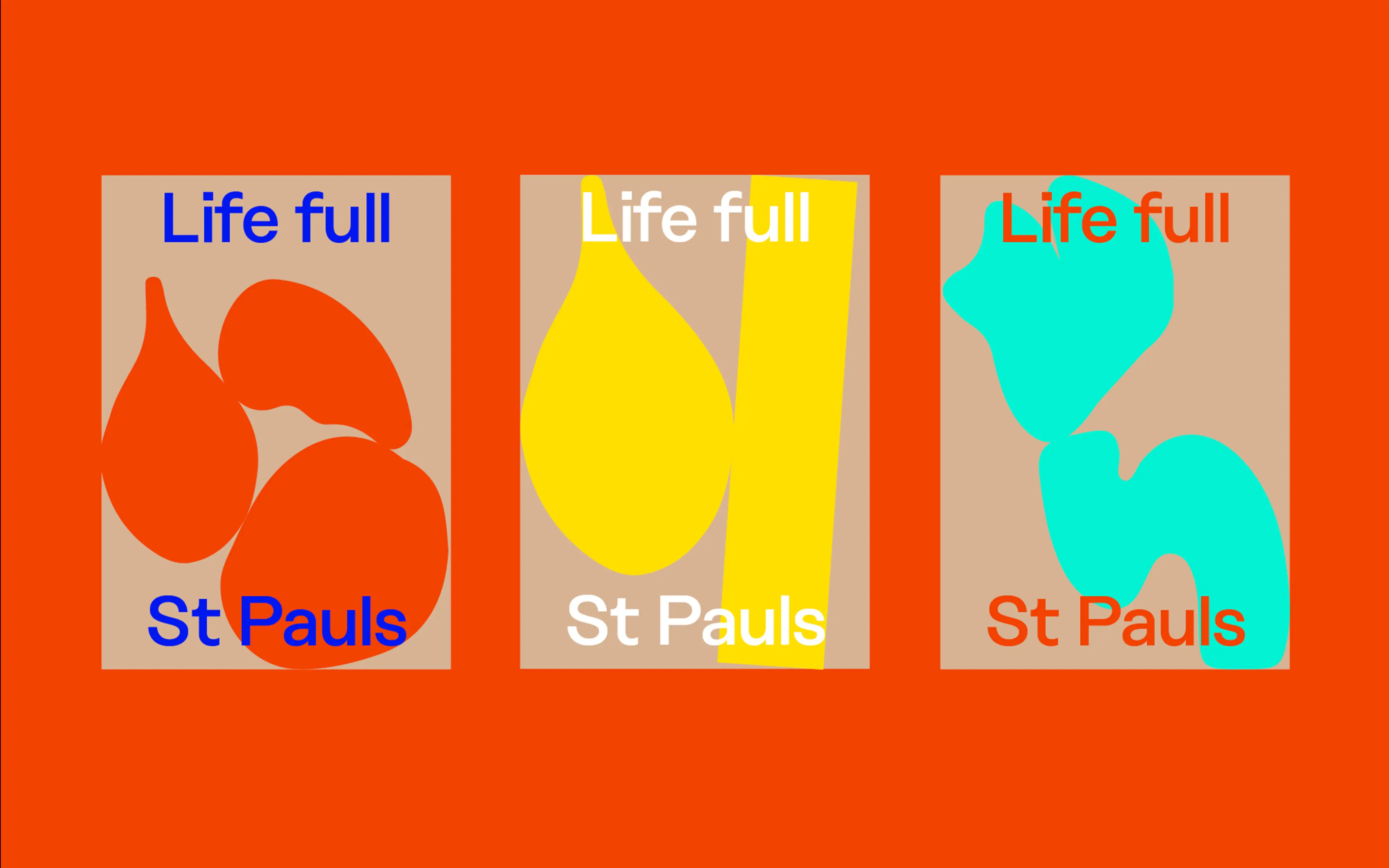
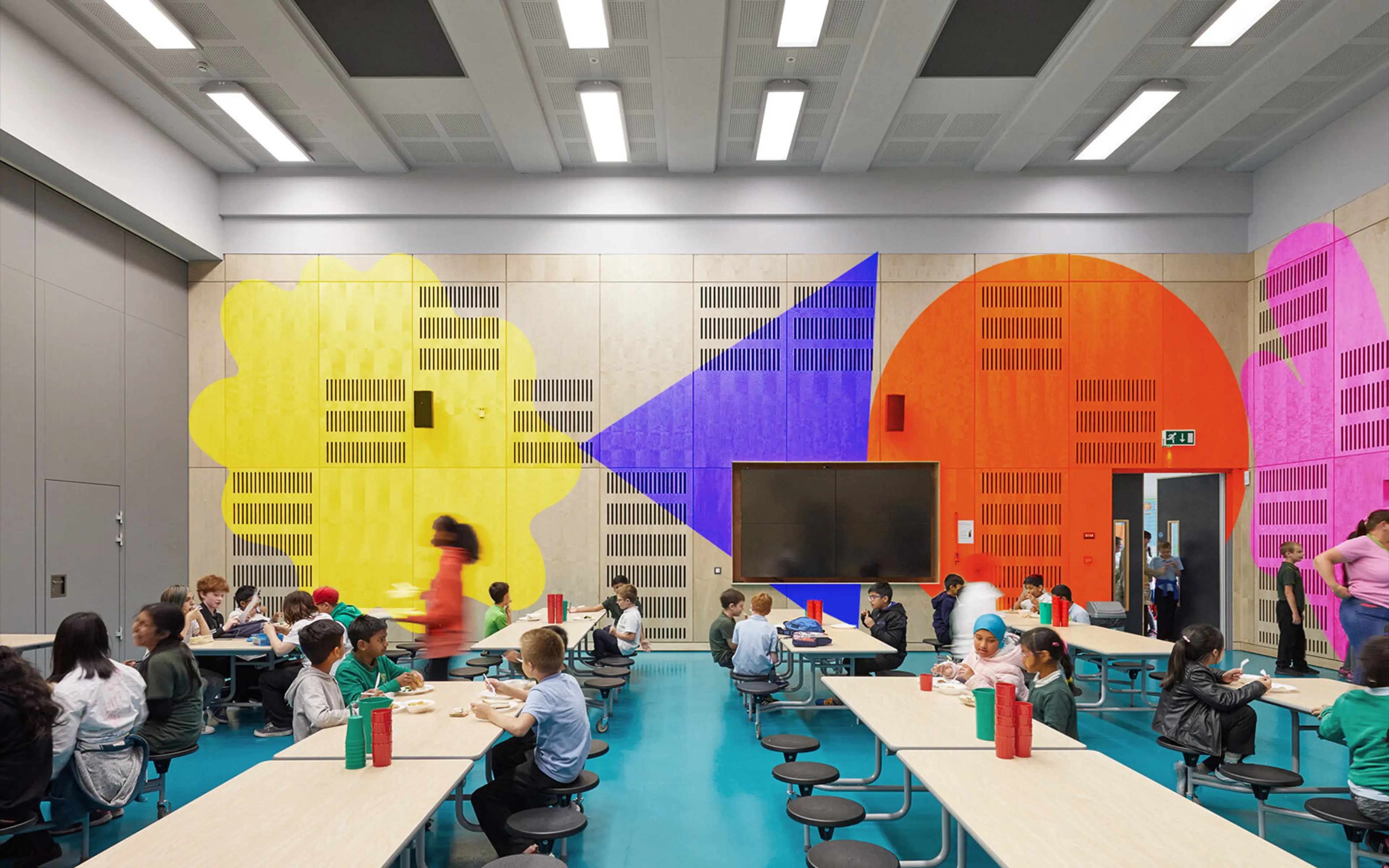
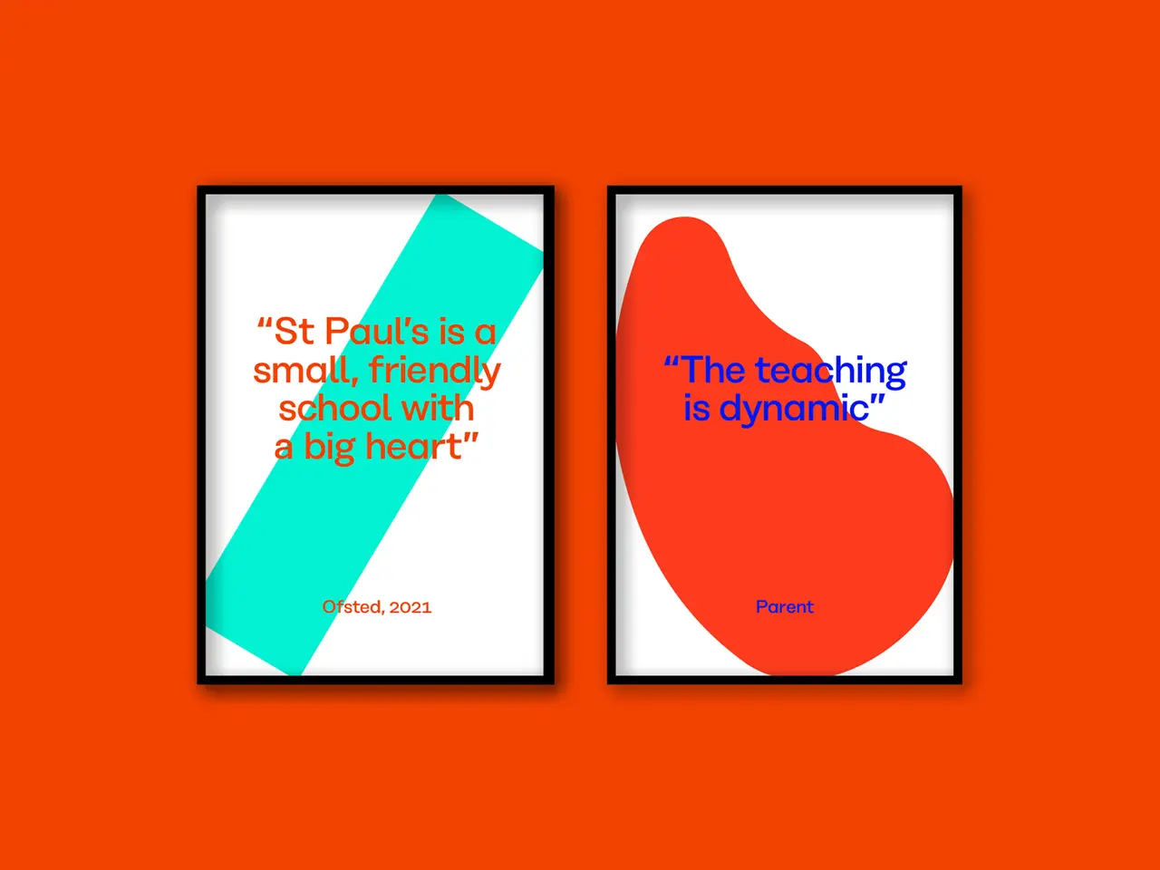
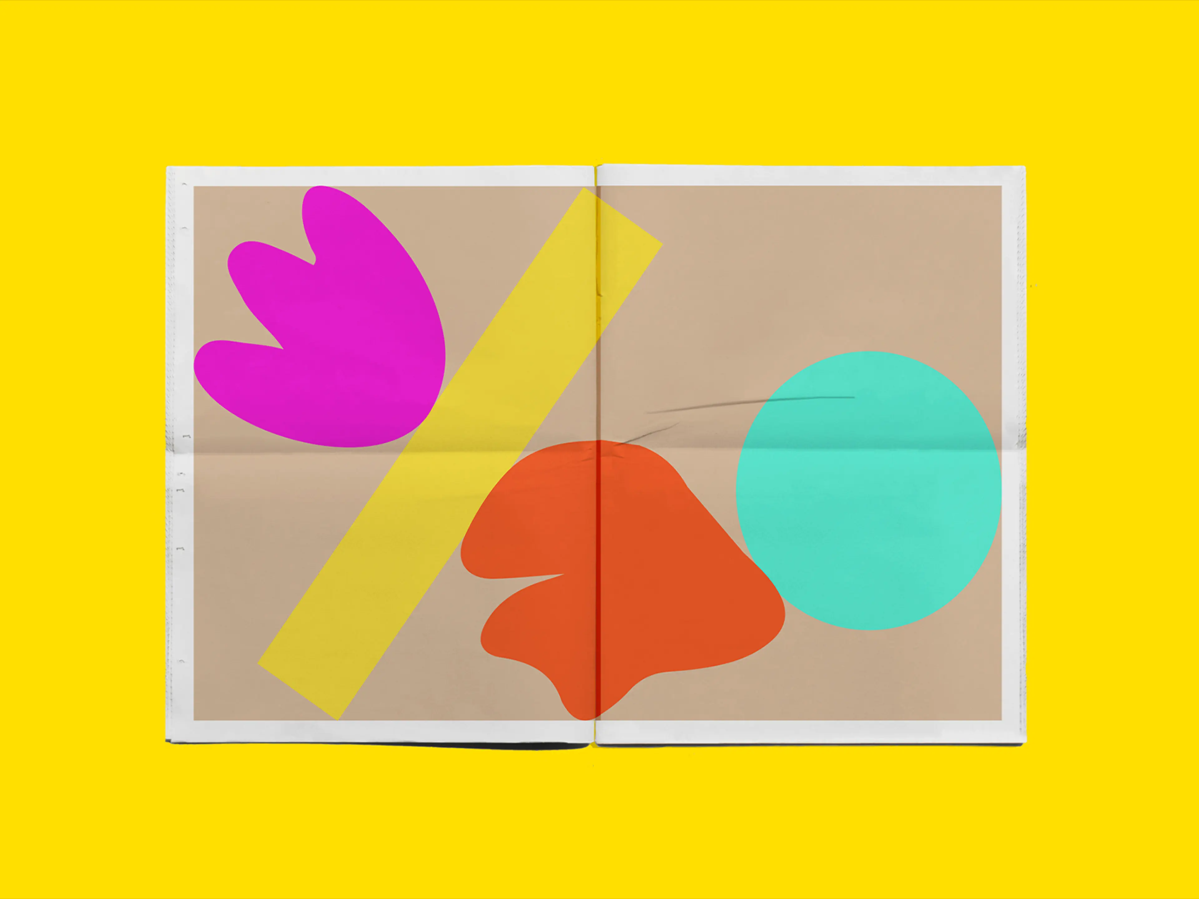
A change of headship forged a change in strategic direction for St. Paul's Church of England Primary School. To mark this gear change the visual and verbal identity needed an injection of energy. Following significant workshopping getting to the essence of the school, we developed a strapline 'Life in all its fullness' which reflected a St Paul’s education.This became the conceptual driver. An energetic visual expression of life at St. Paul's followed with organic and inorganic brightly coloured shapes colliding, and caressing and filling every corner of the canvas on which they sat. Chosen to express vibrancy, fun, diversity, playfulness, interactivity and positivity, they speak of the expansive nature of the curriculum and the fact that no two days are the same at St. Pauls. The relaunched identity was met with resounding buy-in and positivity and in 2024 it won a Creative Pool bronze award in the identity category.