Britten Sinfonia
A bold reimaging
- Creative Pool: Gold (2020)
- Another award: Winner (2021)
- Brand Identity
- Art Direction
- Campaign
- Signage
- Website Design
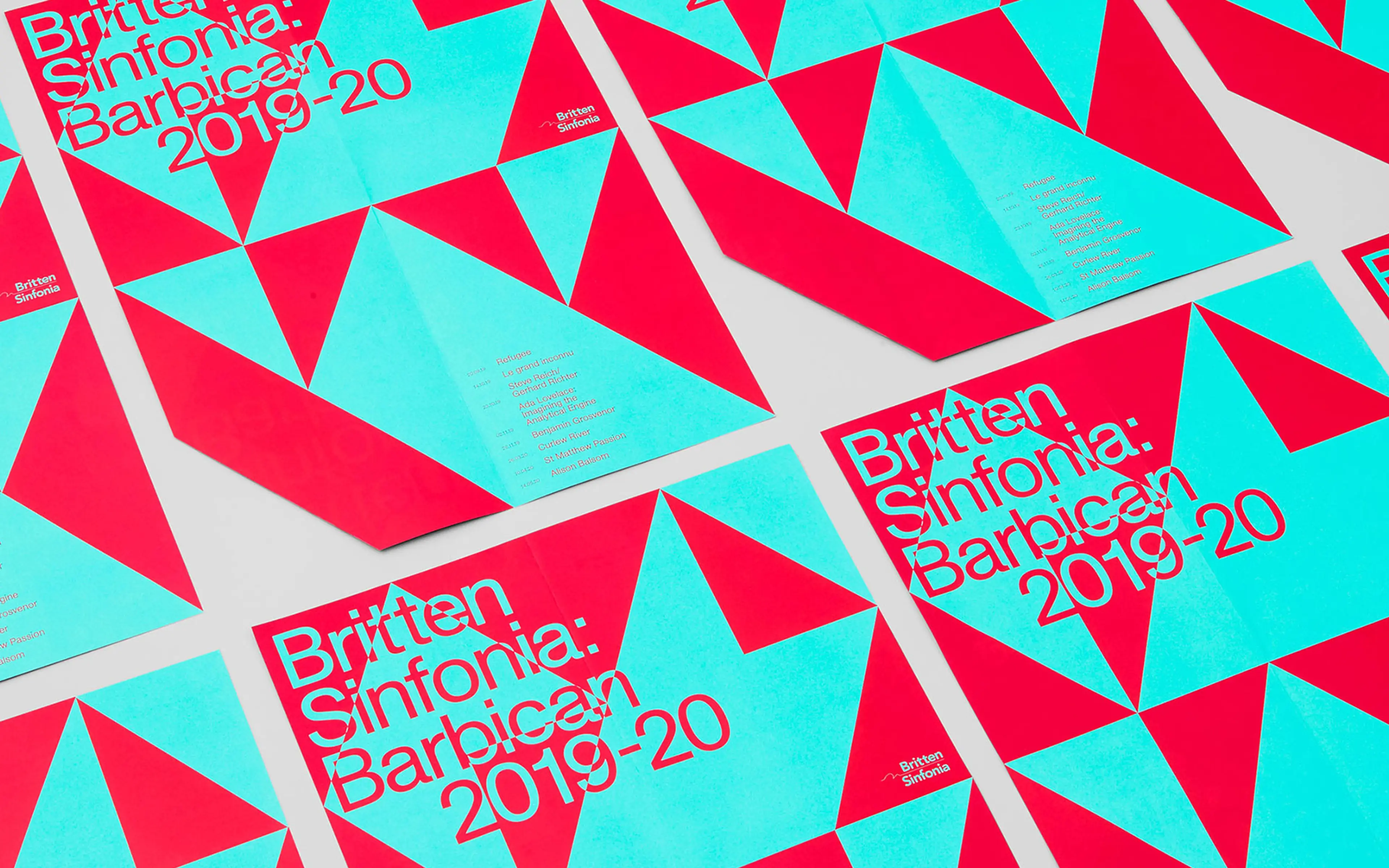
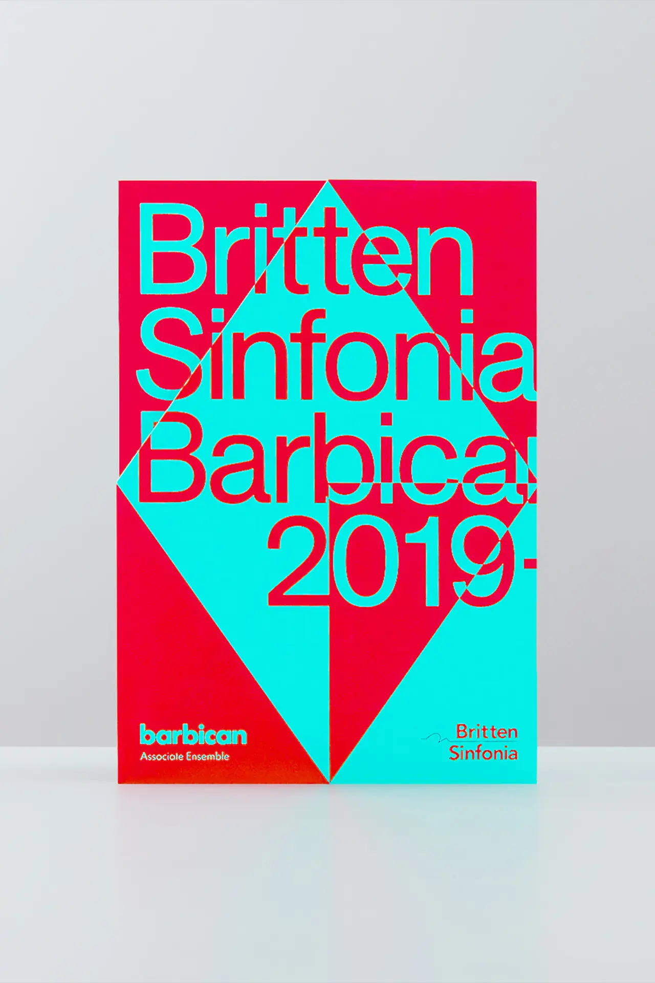
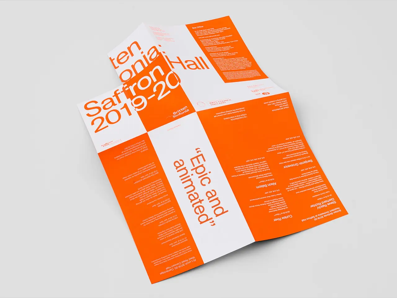
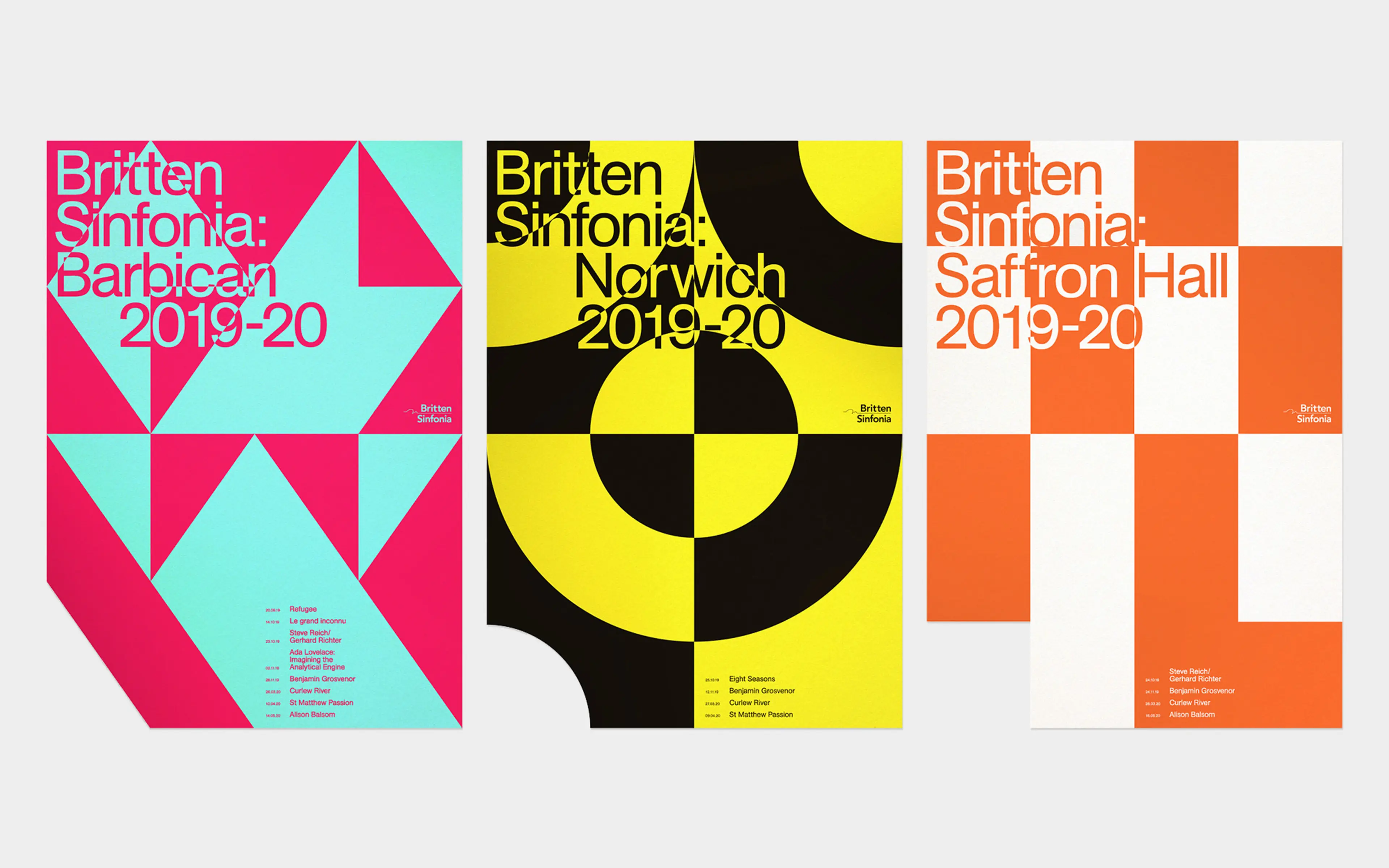
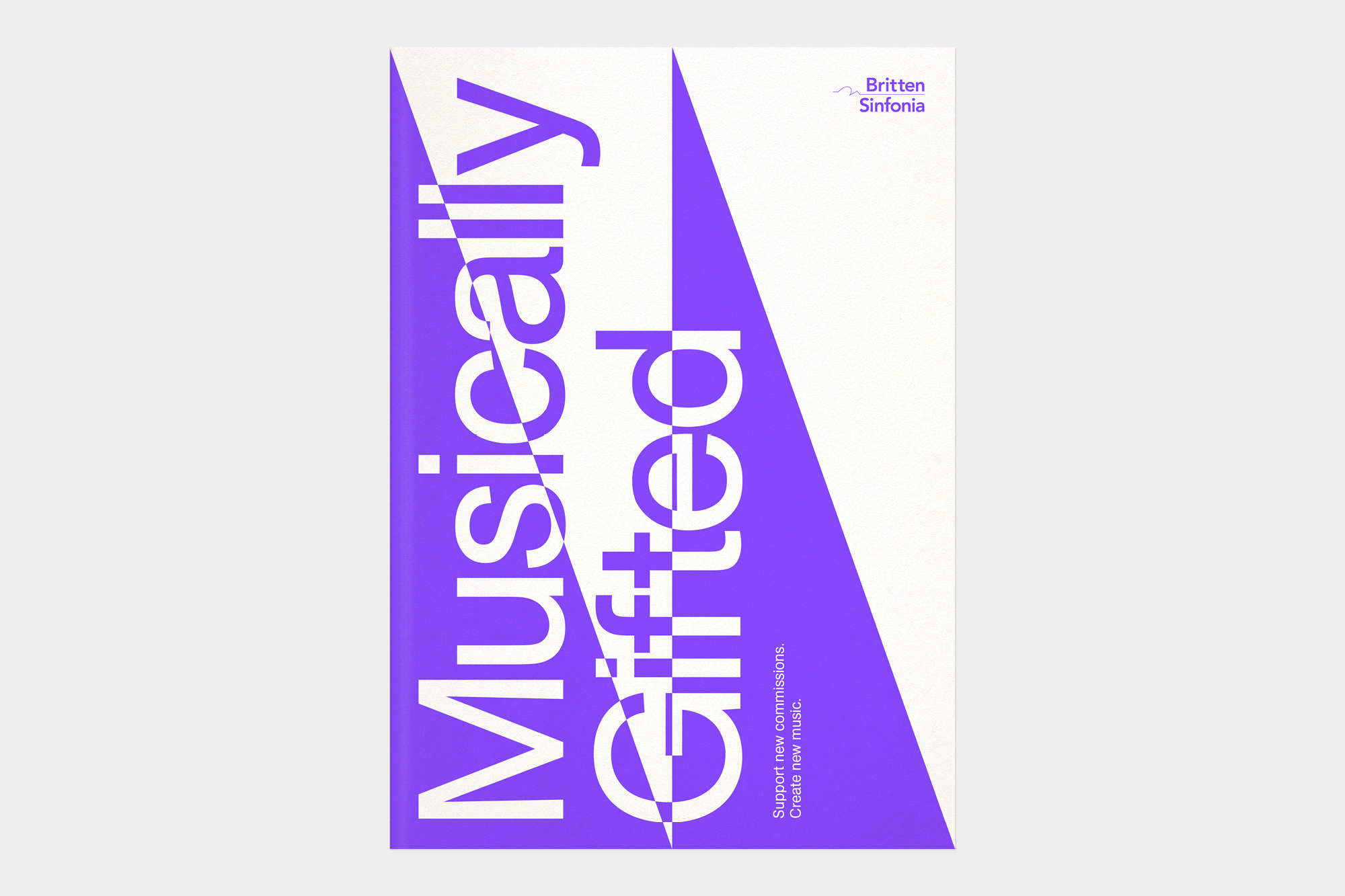
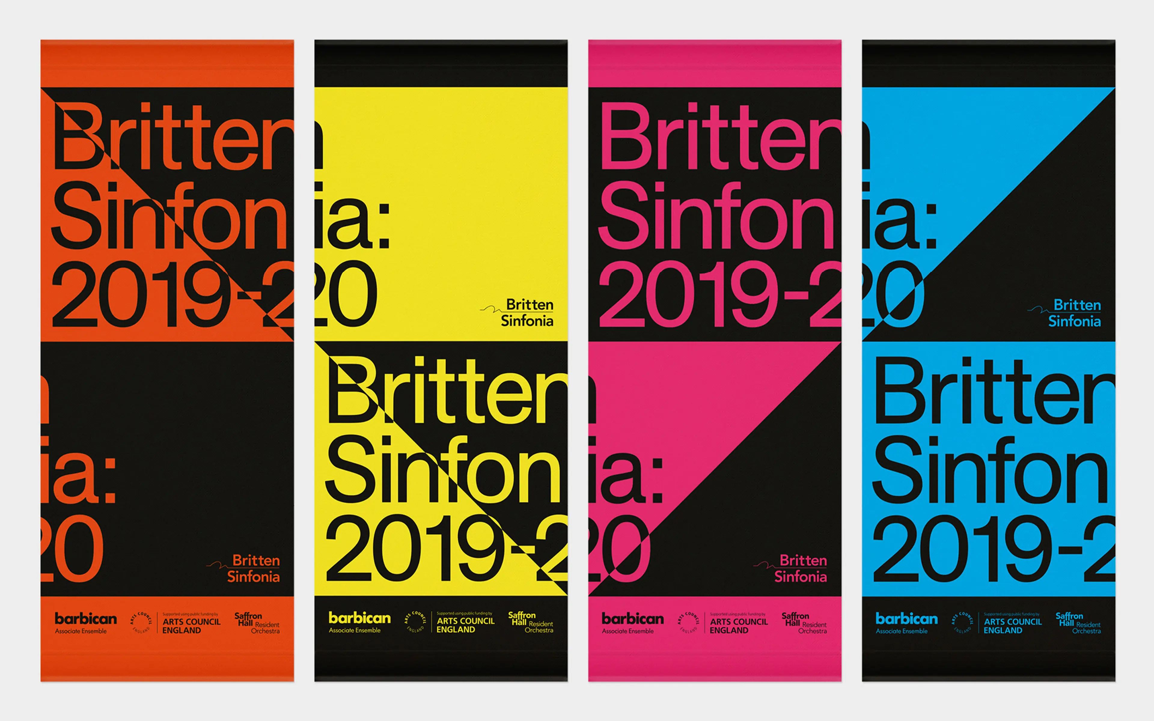
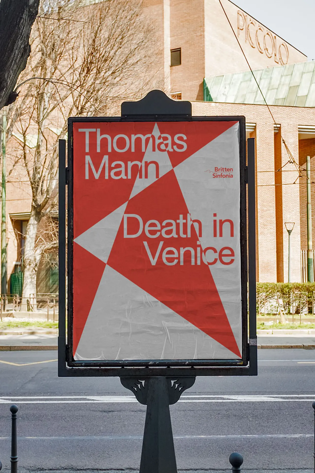
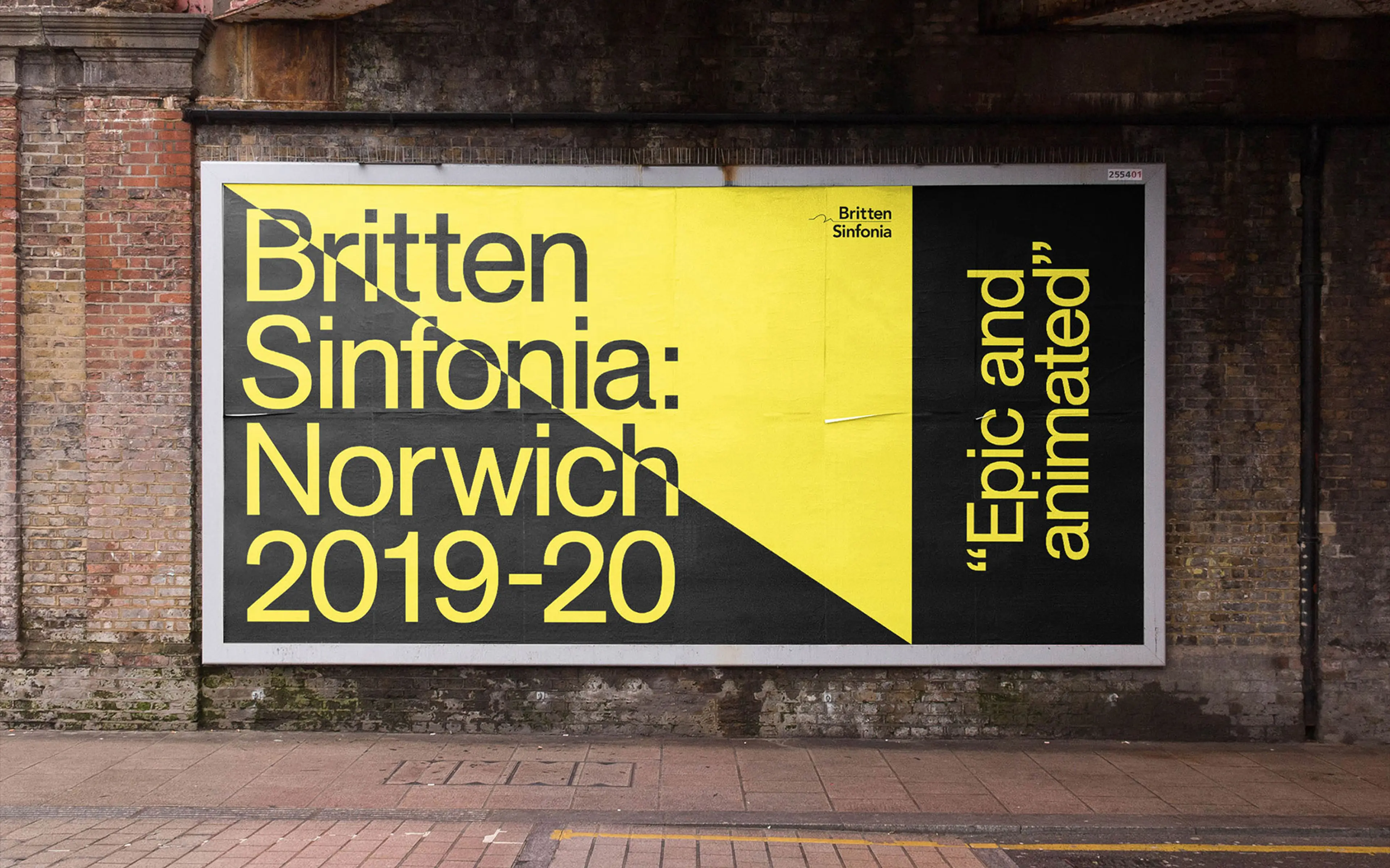
Just over 30 years ago, Britten Sinfonia were established as a bold reimagining of the conventional image of an orchestra. The District were briefed to develop a new brand identity that was a much stronger reflection of their ideology and output and reflected their sonic and visual power and diversity across multiple channels. The newly developed brand identity was a strong reflection of their dynamism and difference. Classic geometric shapes converged and collided to create new forms representative of the breadth and diversity of Britten Sinfonia’s programme and their trailblazing approach to collaboration.
The free-flowing colour palette acts as an identifier for the broad range of events, with varying levels of contrast and clash depending on the audience. Given the radical shift that this brand represented it was incredibly well received by both stalwart Britten Sinfonia fans and new audiences alike. The success of the work was quantified with a double sell out (4000 people) coming to their first big Barbican event since the brand relaunch.